The Psychology Behind Effective Collaboration Software Design
8 August 2026
Building software that people actually want to use together is far harder than it looks. Most collaboration tools fail not because of missing features, but because they ignore how human beings think, feel, and interact. When you strip away the interface, the notifications, and the chat threads, what remains is a simple question: does this tool reduce friction or create it? The answer, more often than not, depends on psychological principles that designers either embrace or accidentally violate.

Why Most Collaboration Tools Fail
The graveyard of collaboration software is filled with products that had every feature a team could want. They had document sharing, video calls, task boards, and real-time editing. They still failed. The reason is rarely technical. It is almost always behavioral.People do not adopt tools because they are comprehensive. They adopt tools because they fit into the way their brains already work. When a tool demands that users change their mental models, learn new workflows, or constantly switch contexts, it creates cognitive load. And cognitive load is the silent killer of adoption.
Consider the typical onboarding experience. A new team member joins a workspace with 40 channels, 12 integrations, and a dozen pinned messages. Their first instinct is not curiosity. It is overwhelm. The brain perceives this as a threat to its ability to get work done, so it withdraws. The user logs in less frequently, misses important updates, and eventually the tool becomes another tab they never open.
Effective design starts with the recognition that attention is a limited resource. Every extra click, every unread badge, every notification is a tax on that resource. The best collaboration tools are not the ones with the most features. They are the ones that make the path from intention to action as short as possible.
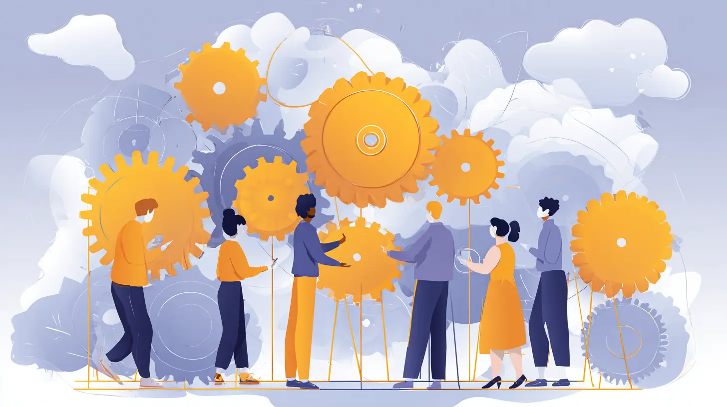
The Role of Cognitive Load in Team Workflows
Cognitive load theory divides mental effort into three types: intrinsic, extraneous, and germane. Intrinsic load is the difficulty inherent to the task itself. Extraneous load is the difficulty added by the environment or interface. Germane load is the effort devoted to learning and understanding.Great collaboration software minimizes extraneous load so that users can spend their mental energy on the work itself. This sounds obvious, but it is constantly violated. Think about a typical project management tool. To update a task status, you might need to click through three menus, select a dropdown, and then confirm a modal. That is extraneous load. It does not help anyone understand the project better. It just makes the act of updating a status feel like paperwork.
The psychological consequence is subtle but powerful. When updating a task feels like work, people do it less often. And when people update tasks less often, the tool's data becomes stale. Then the tool becomes unreliable, and trust erodes. This is a downward spiral that no amount of new features can fix.
A better approach is to reduce the number of steps for frequent actions. If a team updates task statuses ten times a day, that action should be one click, not five. If comments are the primary form of communication, the comment box should be visible without scrolling. These are not UX niceties. They are psychological necessities.
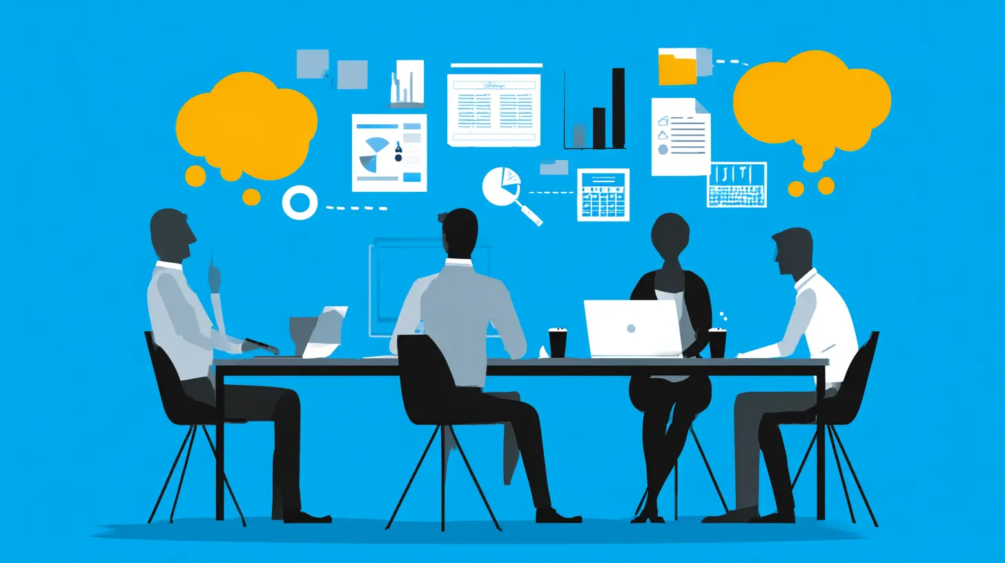
Social Presence and the Illusion of Togetherness
Humans are wired to read faces, tones, and body language. When we communicate through text, we lose most of that information. Collaboration software tries to bridge this gap, but it often fails in ways that make things worse.The term "social presence" refers to how much a medium feels like a face-to-face interaction. Email has low social presence. Video calls have high social presence. Chat sits somewhere in the middle. The problem is that teams often rely on chat for discussions that need high social presence, like resolving conflicts or brainstorming creative ideas.
When a disagreement happens in a chat thread, the lack of nonverbal cues leads to misinterpretation. A sarcastic comment reads as hostile. A short reply reads as passive-aggressive. The brain fills in the gaps with worst-case assumptions. This is not a user error. It is a design failure.
Effective collaboration software does not try to replace face-to-face interaction. It creates clear signals for when a conversation should escalate to a call or a meeting. The best tools make this transition seamless. They embed video call buttons directly into chat threads. They show presence indicators that tell you if someone is available for a quick conversation. They do not force every discussion into a single medium.
The illusion of togetherness is powerful when it works. When you see a colleague's cursor moving in a shared document, you feel like you are working alongside them. That feeling increases trust and reduces the anxiety of waiting for feedback. Designers should amplify these moments of synchronous presence, not bury them under layers of asynchronous notifications.
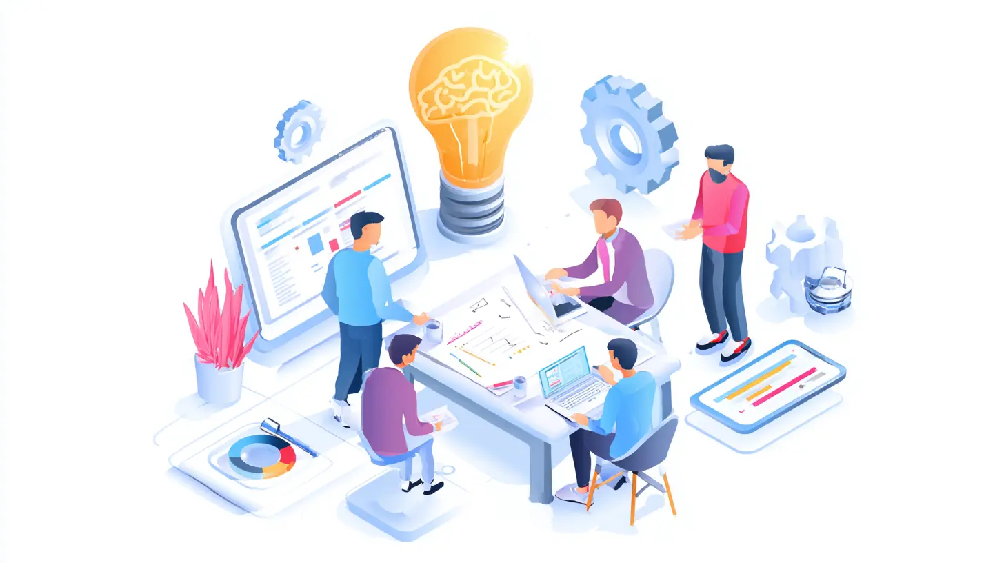
The Paradox of Choice in Feature Design
Barry Schwartz popularized the idea that too many choices lead to paralysis. This applies directly to collaboration software. Every feature you add is a choice you force on your users. Do they use the comment section or the chat sidebar? Do they create a task or a subtask? Do they tag the whole team or just one person?When the number of options exceeds what a user can comfortably hold in their working memory, they stop making decisions. They default to the easiest path, which is often the path of least effort. This is why many teams end up using only 10 percent of the features in their collaboration suite. The other 90 percent is not useless. It is just overwhelming.
The psychological fix is not to remove features. It is to make the most common choices the most visible ones. This is called progressive disclosure. Show the simple version first, and reveal advanced options only when the user asks for them. For example, a task creation form should have three fields: title, assignee, and due date. The advanced fields like priority, labels, and dependencies should be hidden behind an "advanced" toggle.
This approach respects the user's limited attention. It also reduces the anxiety of making the wrong choice. When a user sees fewer options, they feel more confident that they are using the tool correctly. That confidence translates into regular use.
How Feedback Loops Shape Team Behavior
Every action in a collaboration tool produces a reaction. Someone posts a comment, and others respond. Someone completes a task, and the board updates. These feedback loops are the backbone of team behavior. The key is to design them so that positive behaviors are reinforced and negative behaviors are not accidentally rewarded.A classic mistake is the notification system that rewards noise. If every comment sends a push notification to every member of the channel, then people learn to ignore notifications. This is called notification fatigue. The brain habituates to the alerts, and soon no one responds to anything. The tool becomes a monologue.
A better feedback loop is one that is selective and immediate. If a user is mentioned directly, they should get a notification. If they are merely in the channel, they should not. If a task is assigned to them, they should see it prominently. If a task is just updated by someone else, they should not be bothered.
The timing of feedback also matters. Immediate feedback creates a sense of responsiveness. When a user sends a message and sees typing indicators, they feel heard. When they post a document and see someone start editing it within seconds, they feel a sense of accomplishment. These small moments of feedback build momentum.
But there is a trade-off. Too much immediate feedback can create anxiety. Teams that see every keystroke from every member can feel watched and pressured. The design should allow for asynchronous work without constant interruption. The best tools provide feedback on demand, not on a continuous stream.
Trust and Psychological Safety in Shared Spaces
Collaboration requires trust. Team members need to believe that their contributions will not be ridiculed, that their mistakes will not be punished, and that their ideas will be considered fairly. Software can either support or undermine this trust.One way software undermines trust is through permanent edit history that is visible to everyone. When every deleted message and every revision is tracked, users become cautious. They write less, share less, and hesitate before speaking up. This is the opposite of what collaboration should be.
On the other hand, too much opacity also breeds distrust. If you cannot see who changed what, you cannot hold people accountable. The balance lies in offering visibility without surveillance. For example, a document editor can show a history of major revisions without showing every keystroke. A chat tool can allow message editing but show a subtle "edited" marker rather than the full previous text.
Psychological safety also depends on the ability to disagree without conflict. Good collaboration tools provide a space for dissent that is separate from the final decision. Forums for discussion, comment threads that allow anonymous feedback, and voting mechanisms all give team members a voice without putting them on the spot.
The design should also protect against groupthink. When a tool makes it easy to see what everyone else thinks, it creates pressure to conform. A well-designed tool gives each user the chance to form an opinion before seeing the crowd's reaction. This is why anonymous polls and private voting in meetings are valuable. They protect the individual's psychological space.
The Attention Economy and Notification Design
Notifications are the most psychologically loaded part of any collaboration tool. They interrupt. They demand attention. They create a sense of urgency that may not be real. The best designers treat notifications as a scarce resource, not as a default behavior.There are two types of attention: focused and roving. Focused attention is when you are deeply engaged in a task. Roving attention is when you are scanning for incoming information. Collaboration tools need both, but they often confuse the two.
When a user is in a flow state, writing code or drafting a report, a notification is a disruption. It takes about 23 minutes to fully regain focus after an interruption, according to common productivity research. That is a huge cost. A tool that sends constant notifications is effectively stealing hours of productive time from its users.
The solution is not to eliminate notifications but to make them context-aware. If a user is actively typing in a document, do not show a popup about a new comment in another document. If a user has not opened the app for an hour, do not send a push notification for a message that is not directed at them.
Some of the best tools use a "quiet hours" system where notifications are batched and delivered at specific intervals. This respects the user's attention while still keeping them informed. The trade-off is that real-time collaboration becomes slightly less real-time. But for most teams, a 15-minute delay in notification is far better than constant interruption.
Designing for Asynchronous and Synchronous Tension
Teams do not always work at the same time. Remote teams span time zones. Hybrid teams have members in the office and at home. The design of collaboration software must handle both synchronous and asynchronous modes, and the transition between them is where many tools fail.Asynchronous communication is forgiving. It allows for thoughtful responses and deep work. But it lacks the immediacy of a live conversation. Synchronous communication is energizing, but it demands that everyone be present at the same moment. The best tools let users switch between these modes without losing context.
For example, a video call should be recordable and automatically transcribed. The transcription then becomes an asynchronous artifact that team members can read later. A chat conversation should be summarizable into a decision document. A whiteboard session should be exportable as a static image that can be annotated later.
The psychological challenge is that synchronous tools create a sense of urgency that is addictive. People feel productive when they are in meetings and chats. But this productivity is often an illusion. The design should make asynchronous work feel just as legitimate. It should celebrate written updates as much as live discussions.
One way to do this is to make async updates more visible. Instead of burying a status update in a chat thread, surface it on a dashboard. Instead of requiring a live meeting to make a decision, allow for a structured async vote. When the tool gives equal weight to both modes, teams naturally find the right balance.
The Impact of Visual Hierarchy on Group Decision Making
The way information is laid out on a screen affects how teams make decisions. Visual hierarchy is the principle that some elements are more prominent than others. It guides the eye and tells the brain what is important.In a collaboration tool, the most important information should be the most visible. If a project is behind schedule, the schedule should be the first thing people see. If a document has a critical question unanswered, the question should be highlighted, not buried in a comment thread.
Many collaboration tools fail this test. They have a uniform grid of cards, all the same size and color. Nothing stands out. The brain cannot prioritize, so it treats everything as equal. The result is that critical issues get lost in the noise.
A better approach is to use size, color, and position to signal importance. Urgent tasks should be larger and red. Normal tasks should be smaller and neutral. A summary of key decisions should be at the top of the page, not at the bottom. This is not just aesthetics. It is a method for reducing the cognitive effort required to understand the state of a project.
But visual hierarchy can also be misleading. If everything is highlighted, nothing is highlighted. The design should be conservative with emphasis. Only the truly critical information should stand out. Everything else should recede into the background.
Common Misconceptions About Gamification
Many designers think that adding points, badges, and leaderboards will motivate teams to collaborate more. This is a misconception. Gamification works for individual tasks that are inherently boring. It does not work for complex collaboration that requires trust and creativity.The psychology of extrinsic motivation is tricky. When you reward an activity with points, the brain starts to focus on the points rather than the activity. This is called the overjustification effect. Over time, the intrinsic motivation to collaborate diminishes. People start making decisions based on what earns them points, not on what is best for the team.
There are some areas where gamification is useful. For example, a leaderboard that shows who has responded to the most support tickets can be motivating for a support team. But for a product team working on a design, a leaderboard is meaningless and potentially harmful. It creates competition where collaboration is needed.
The better alternative is to focus on social proof and recognition. Show team members when their contribution helped someone else. Show a message like "Your feedback helped Sarah fix the bug" instead of "You earned 50 points." This type of feedback reinforces the social value of collaboration rather than the individual reward.
Building Habits and Reducing Friction
The ultimate goal of collaboration software is to become a habit. Users should not have to think about opening the tool. It should be the default place where work happens. Habit formation relies on a loop of cue, routine, and reward.The cue is the trigger that tells the user to open the tool. It could be a notification, a bookmark, or a daily reminder. The routine is the action the user takes, like checking the task board or reading new comments. The reward is the feeling of being up to date and in control.
Designers can strengthen this loop by making the reward immediate and consistent. When a user opens the tool, they should see something new and relevant within seconds. If they open the tool and see nothing new, the habit weakens. This means the tool must be actively used by the team. A collaboration tool that is opened but empty is worse than no tool at all.
Reducing friction is the most direct way to encourage habit formation. Every login step, every page load, every search query is friction. The best tools load fast, remember the user's preferences, and show the most relevant information on the home screen without requiring a search.
One practical tip is to make the home screen a dashboard of what needs attention today. Not a generic feed, but a personalized list of tasks, mentions, and upcoming deadlines. This gives the user a reason to open the tool every morning and gives them a clear sense of what to do next.
The Trade-Off Between Flexibility and Structure
Collaboration software often tries to be flexible enough for every team. This is a mistake. Flexibility comes at the cost of structure, and structure is what reduces cognitive load.A blank canvas is liberating, but it is also exhausting. When a team opens a new project and sees nothing but an empty page, they have to decide everything. How do we organize this? What columns do we use? What statuses exist? These decisions consume time and energy that could be spent on the actual work.
The best tools provide a default structure that is opinionated. They say, "Here is a board with three columns: To Do, Doing, Done." This gives the team a starting point. They can customize it later, but they do not have to start from zero. This reduces the cognitive load of setup and allows the team to focus on the work.
The trade-off is that a rigid structure can feel constraining. Some teams have unique workflows that do not fit a standard template. The design should allow for customization without requiring it. The default should be simple, and the advanced options should be available but not prominent.
Practical Recommendations for Designers and Product Managers
If you are designing or selecting collaboration software, keep these psychological principles in mind.First, prioritize the user's attention. Every feature should be evaluated on whether it helps or hurts the user's ability to focus. If a feature adds more noise than signal, cut it.
Second, design for the first hour of use. The first impression is critical. Make the onboarding process short and satisfying. Show the user a quick win within the first ten minutes. This builds confidence and reduces the chance of abandonment.
Third, test with real teams, not just individual users. Collaboration is a group behavior. A feature that works well for a single user may fall apart when used by a group. Run usability tests with at least three people working together.
Fourth, respect the difference between synchronous and asynchronous modes. Do not force real-time interactions on teams that are in different time zones. Do not force async workflows on teams that are co-located and prefer to talk in person.
Fifth, measure the right metrics. Do not just track daily active users. Track the quality of collaboration. Are tasks being completed on time? Are documents being reviewed? Is feedback being incorporated? These are the outcomes that matter.
Conclusion
Collaboration software is not a neutral tool. It shapes how teams think, feel, and behave. The psychology behind effective design is about understanding human limitations and designing around them. It is about reducing cognitive load, building trust, respecting attention, and creating feedback loops that reinforce positive behavior.The best tools are not the ones with the most features. They are the ones that make collaboration feel natural. They disappear into the background and let the team focus on the work. That is the ultimate goal of design, and it requires a deep understanding of the human mind, not just the technology.
all images in this post were generated using AI tools
Category:
Collaborative SoftwareAuthor:

Marcus Gray